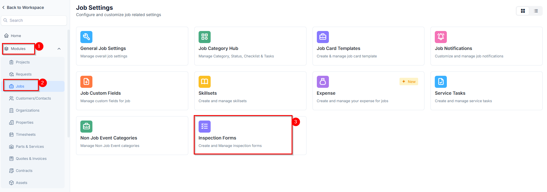
Navigation: Settings -> Modules -> Jobs -> Inspection forms
Navigating to job inspection forms
To configure inspection forms, follow these steps:- Select the “Settings” module from the left navigation menu.
- Click Modules and choose Jobs to open the Job Settings page.
- Click on Inspection Forms. The inspection forms listing page will appear.
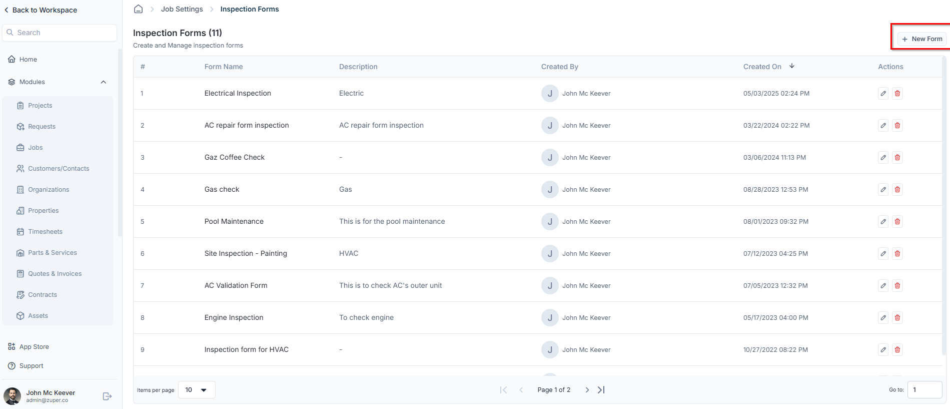
- The inspection forms listing page will appear, displaying all existing inspection forms available for the job.
Creating a new inspection form
To create a new inspection form:- Click + New Form at the top right of the inspection forms listing page.
- Enter the following details and click Proceed to begin customizing the inspection form.
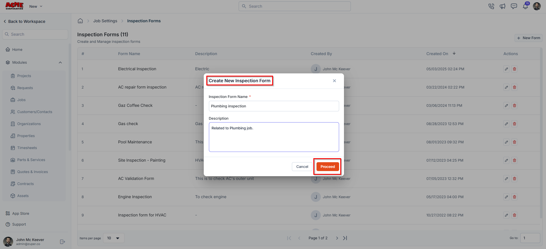
- Inspection Form Name (Mandatory) – Enter a name for the inspection form.
- Description – Provide a brief description of the inspection form.
Customizing the inspection form
To customize the inspection form, simply drag and drop fields from the right panel into the form layout. Arrange them as needed to suit your inspection requirements. You can also edit, clone, or delete fields using the action menu available next to each field. For more details on how to configure custom fields, check out this article.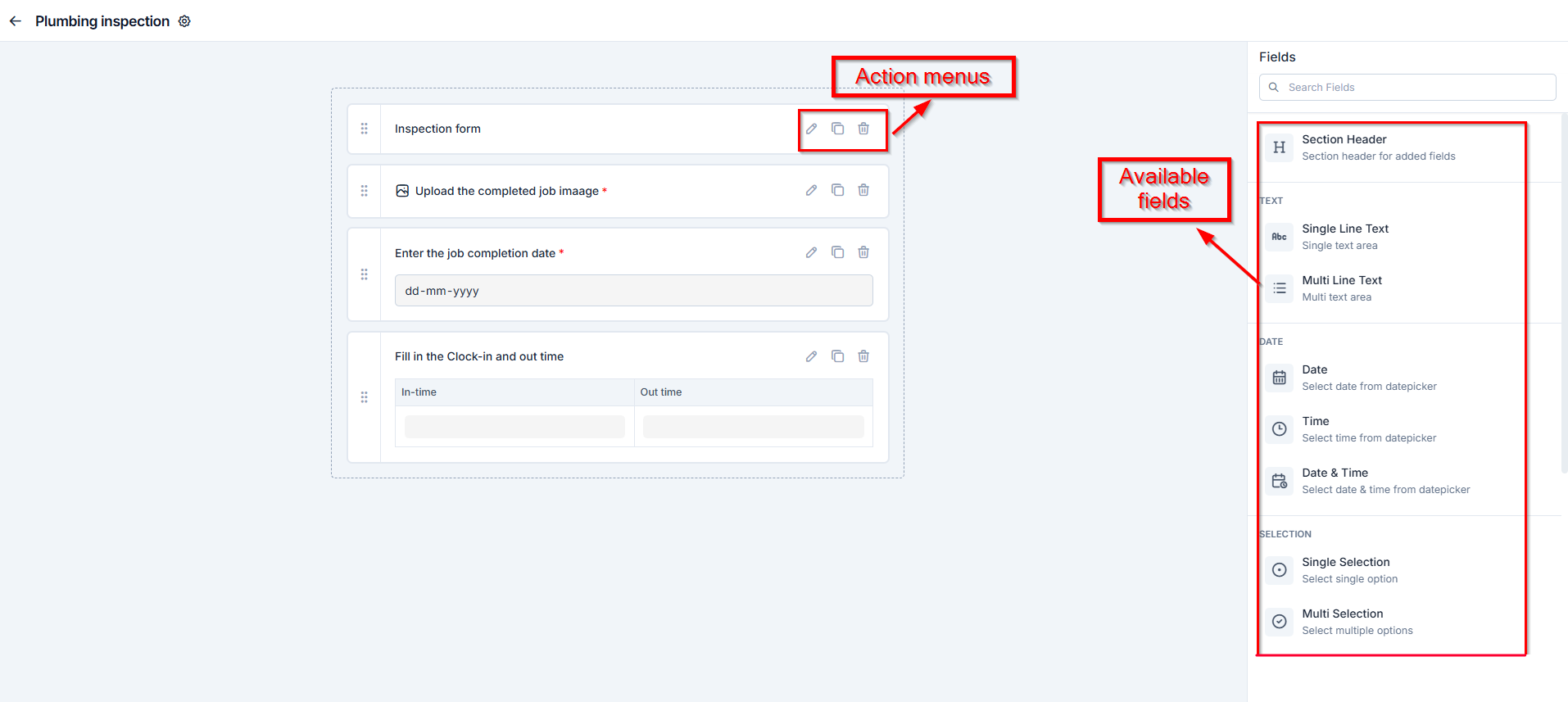
Available fields
Available fields
- Text
- Single-Line Input: This allows you to create a field to enter a single line of free text.
- Multi-Line Input: This allows you to create a field to enter multiple lines of free text.
- Date
- Date: This allows you to create a field to select a specific date from a calendar.
- Time: This allows you to create a field where you can select a specific time.
- Date & Time: This allows you to create a field where both date and time can be selected.
- Selection
- Single-Selection: This allows you to create a radio input Field where one of the provided options can be selected.
- Multi-Selection: This allows you to create check boxes where the provided options can be checked.
- Drop-Down: This allows you to create a drop-down field with the required list of options.
- Media
- Upload: This allows you to create a file input field to upload files.
- Single Image: This allows you to upload a single image as input.
- Multi Images: This allows you to upload multiple images in one field.
- Barcode Scan: This allows you to scan and capture barcodes using a device camera or scanner.
- AI Walkthrough Video: Lets technicians record a guided video walkthrough of the job site directly from the inspection form. Zuper AI transcribes the audio and produces a written summary alongside the video and any photos captured. Available on the mobile app only.

- Misc
- Look up: This allows you to create a file input field to look up the products, products added in job, parts added in asset, users, and assets.
- Data Table: This allows you to create a dynamic table field to input structured data in rows and columns.
- Signature: This allows you to sign directly within the form using touch or a mouse input.
Editing an inspection form
To modify an existing inspection form, follow these steps:- On the inspection forms listing page, click the pencil icon next to the inspection form you want to update.
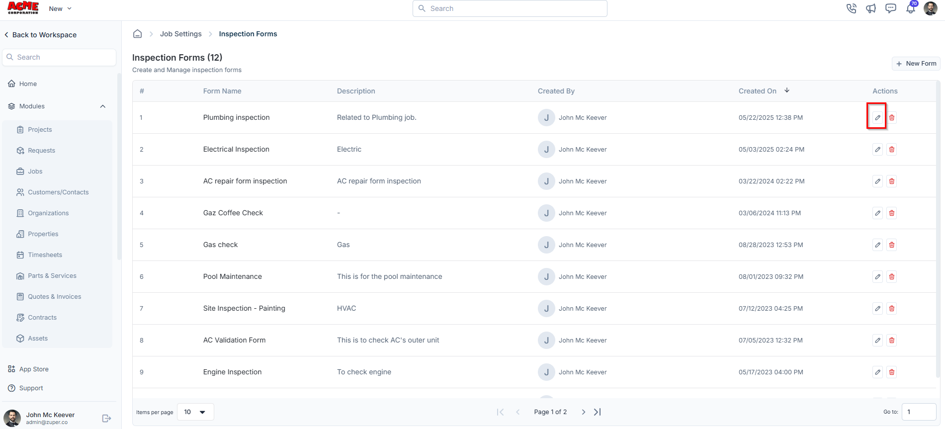
- Make the necessary changes and click Save to update the inspection form.
Deleting an inspection form
To remove an inspection form permanently:- On the inspection forms listing page, click the delete icon next to the inspection form you want to remove.
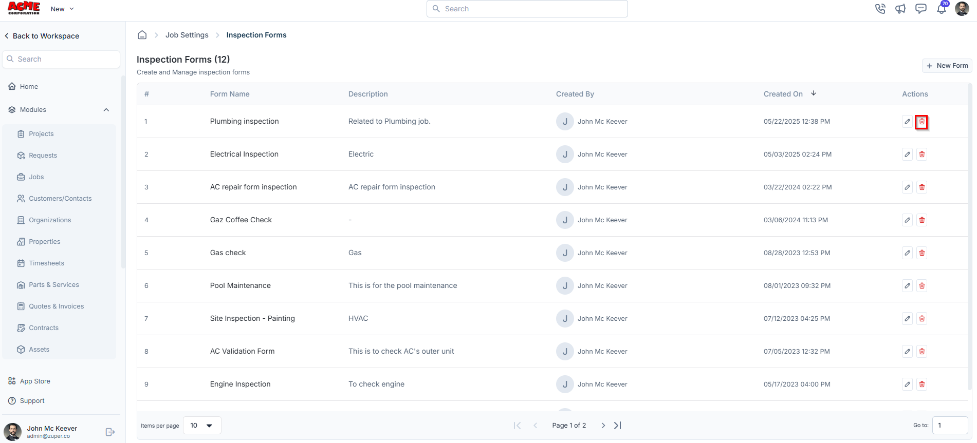
- A confirmation dialog box will appear.
- Click “Delete” to confirm and permanently remove the inspection form.